SmartWEB includes a built-in, web-based graphics editor (SVG Editor) for creating and editing Scalable Vector Graphics (SVG). These graphics are essential for building Human Machine Interface (HMI) pages as well as other types of web pages. The pages created can be animated using data provided by SmartWEB Data Providers. This feature allows users to design and view HMI pages similar to those used in operator stations within control rooms.
This chapter will guide you through the process of creating and managing graphical displays to achieve a dynamic visual representation of your process. You will learn how to:
Working with the editor tools to create static
SVGgraphics.Use dynamic elements (
Shapes) from SmartWEB shape library to render basicHMIelements such asValves,Motors,Regulators, etc.
Below is an example of a data-driven SmartWEB HMI graphic page.

The graphical editor is also used for the development of individual shapes. SmartWEB provides a library of pre-built shapes that are ready for use. Additionally, users can create custom shapes to meet specific project requirements and extend the built-in library. The Dynamic Shapes Development chapter details how to create custom shapes.
Editor Features
The Smartsys Svg Editor module provides a graphical editor. The module brings a new
Content Field to the fieldset that can be attached to every Content Type. The following image shows the configuration of a Content Type with an embedded Svg Field. Visit the
Content Anatomy chapter for additional information on Content Types, Content Parts,
and Content Fields.
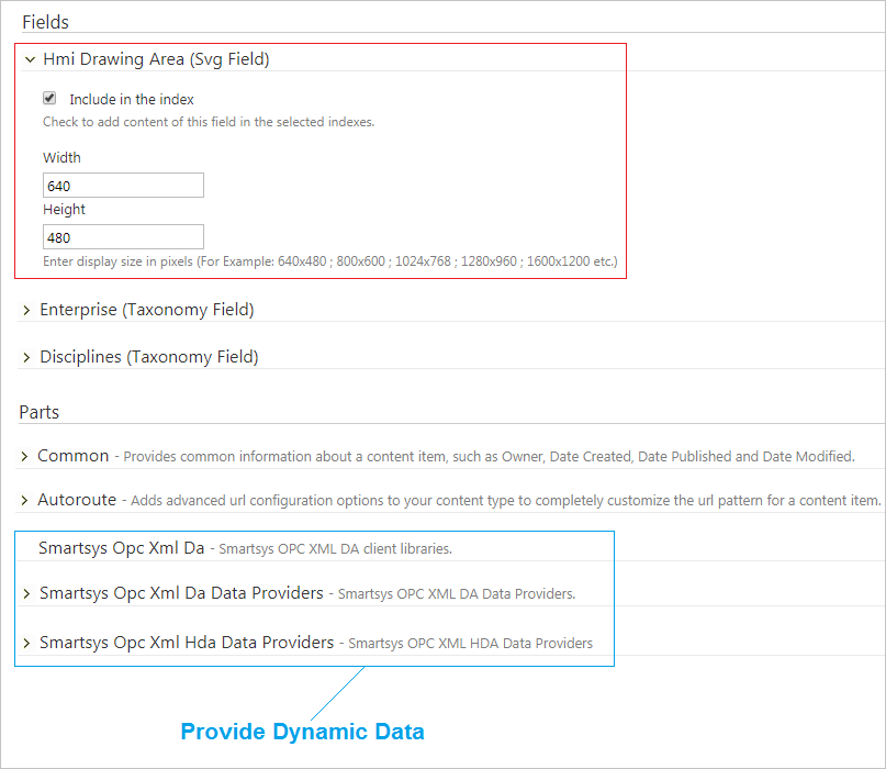
There are a number of Svg Field configurations available on the Content Type page. The user can set the default dimensions of the drawing area and select whether the SVG content needs to be indexed. The default size of the drawing area for each Content Item can be changed at a later time. Indexing will allow the user to search for items inside the graphical content.
Note:
Note that there are three vital parts added to the Content Type: Opc Da access, Opc Hda access and a common Opc Xml client library. The web page is animated thanks to the data provided by these parts. The Access to OPC Data chapter covers Opc Da and Opc Hda data providers.
The following image is an example of HMI content loaded inside the editor in the Content Item configuration page. In this section we will go over the available tools and functionality.

Menu Edit
The SVG-Edit button in the top left corner of the editor displays a drop-down menu with several options.
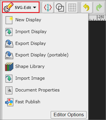
New Image- Create a new document.
Import Display- Upload anSVGdocument (display) to the canvas area.
Export Display- Download the currentSVGdocument with theOpc Xml Data Providers.
Export Display (portable)- Download the currentSVGdocument without the
Opc Xml Data Providers.
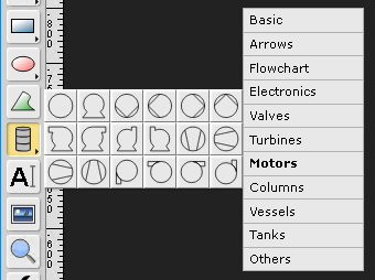
Shape Library- Access the library of available shapes. The shapes are organized in folders according to their purpose. The following example shows a few of the default analog shapes included in SmartWEB.

Import Image- Import a standardSVGimage to the canvas area.
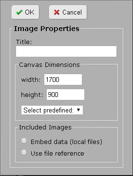
Document Properties- By default, the new display inherits the canvas dimensions from its
Content Typeconfiguration. This option allows the user to change the width and height of the drawing area.
Fast Publish- ExecutesUnpublishandPublish Nowcommands sequentially for the currentContent Item. This functionality provides a convenient way to publish an edited/updated
Content Itemwith one operation. The chapter Manage Content provides a complete explanation of content publishing and content versioning.
Important
The Fast Publish option will publish the Content Item without updating its version in the database. It is good practice to use it over the standard Publish Now functionality.
A good alternative to the Fast Publish option is the Re-publish option:

Basic Tools

(1) - Selection Tool - Allows the user to select and move items in the editor. The user has the ability to select multiple items by holding Shift and left-clicking on the items.
(2) - Pencil tool - Allows the user to draw a custom figure. The size and color of the stroke are adjustable via the Color Platte Tools (21-25).
(3) - Line tool / Connect two objects - Holding down the left mouse button on the icon will allow the user to select one of two tools. The first tool (Line tool) provides the ability to draw a straight line from point A to point B. The second tool (Connect two objects) allows the connection of two objects with a straight line.
(4) - Rectangle / Square / Free hands rectangle - Holding down the left mouse button on the icon will allow the user to select one of three tools: Rectangle, Square, and
Free hands rectangle. The first two options allow the user to draw a rectangle and a square. The third option (Free hands rectangle drawing) allows the user to draw any shape, which will be redrawn by the editor as a rectangle (according to the height, width, and position of the shape).
(5) - Ellipse / Circle / Free hands ellipse - Holding down the left mouse button on the icon will allow the user to select one of three tools: Ellipse, Circle, and Free hand ellipse. The first two options allow the user to draw an ellipse and a circle. The third option (Free hands ellipse) allows the user to draw any shape, which will be redrawn by the editor as an ellipse (according to the height, width, and position of the shape).
(6) - Path tool - Allows the user to draw a free hand shape.
(7) - Static Shape Library - Allows the user to add static shapes to the canvas. The shapes are organized by type.
(8) - Text tool - Allows the user to place text on the canvas.
(9) - Image tool - Allows the user to insert an image (pnt, jpeg, jpg, and more).
(10) - Zoom tool - Allows the user to zoom in on a certain area.
(11) - Diagnostic - Allows the user to analyze dynamic elements. A more detailed explanation of this functionality will be provided in the Display Diagnostic section of this chapter.
(12) - Item Configuration - Allows the user to edit the parameter settings of dynamic elements.
(13) - Display Behaviour Configuration - Allows the user to configure the short and long term Opc Xml HDA Providers of the display (page), as well as the styling of the document. A more detailed explanation of this functionality will be provided in the Display Configuration section of this chapter.
(14) - Full Screen - Toggle full-screen mode.
(15) - Eye dropper tool - Provides the color of the selected element.
(16) - Edit Source - Provides the source code of the canvas content.
(17) - Wireframe Mode - Renders the canvas elements in black and white mode.
(18) - Show / Hide Grid - Toggle the grid view.
(19) - Undo - Undo the last action.
(20) - Redo - Redo the last action.
(21) - Change Zoom Level - Change the canvas zoom level.
(22) - Change fill color - Allows the user to change the color and opacity of the element background.
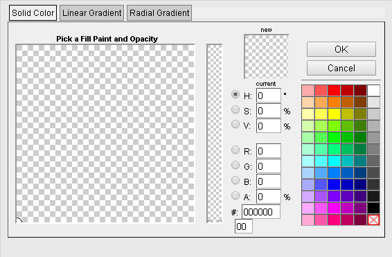
(23) - Change stroke color - Allows the user to change the size, style and color of the element border.
(24) - Change selected item opacity - This tool changes the transparency of the selected element.
(25) - Default color palette - Provides the user with a default color palette.
Upon selection of an element, a toolbar with additional instruments will appear at the top of the editor, as shown on next picture.
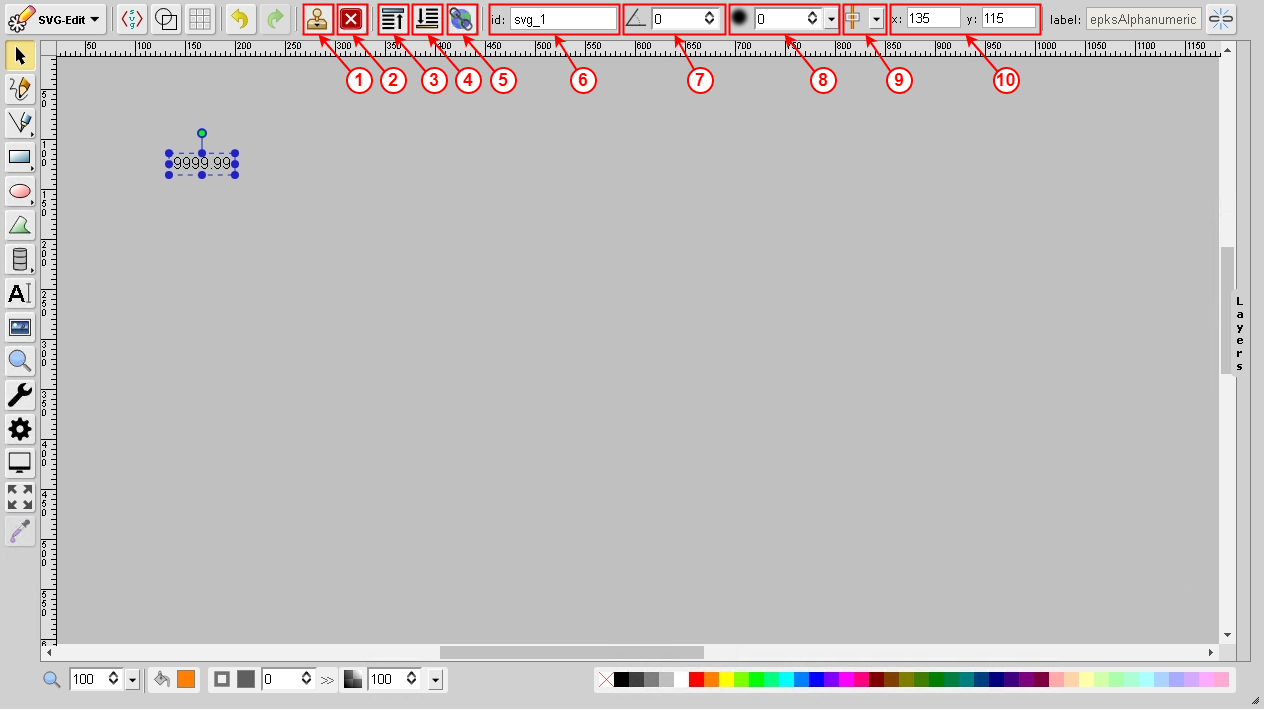
(1) - Duplicate Element- Duplicate all selected elements in the canvas.
(2) - Delete Element - Delete all selected elements in the canvas.
(3) - Bring to front - Bring the selected element to the front.
(4) - Bring to back - Bring the selected element to the back.
(5) - Hyperlink -Allows the user to create a link to an external resource.
(6) - ID - Allows the user to change the ID of the element. Each page element has a unique identifier (ID).
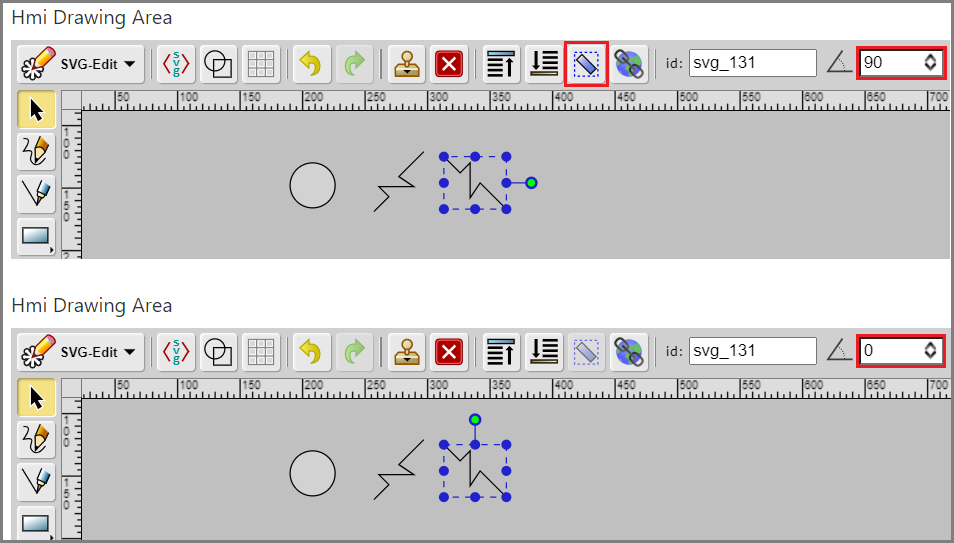
(7) - Change rotation angle - Allows the user to change the rotation angle of the selected element.
(8) - Change Gaussian blur value - Allows the user to change the blur of the selected element.
(9) - Align element to page - This tool provides several options which allow the user to align the selected item to the page.
(10) - X and Y - Allows the user to change the horizontal and vertical coordinates of the selected element.
When two or more items on a page are selected, the following tools will appear at the top of the editor.
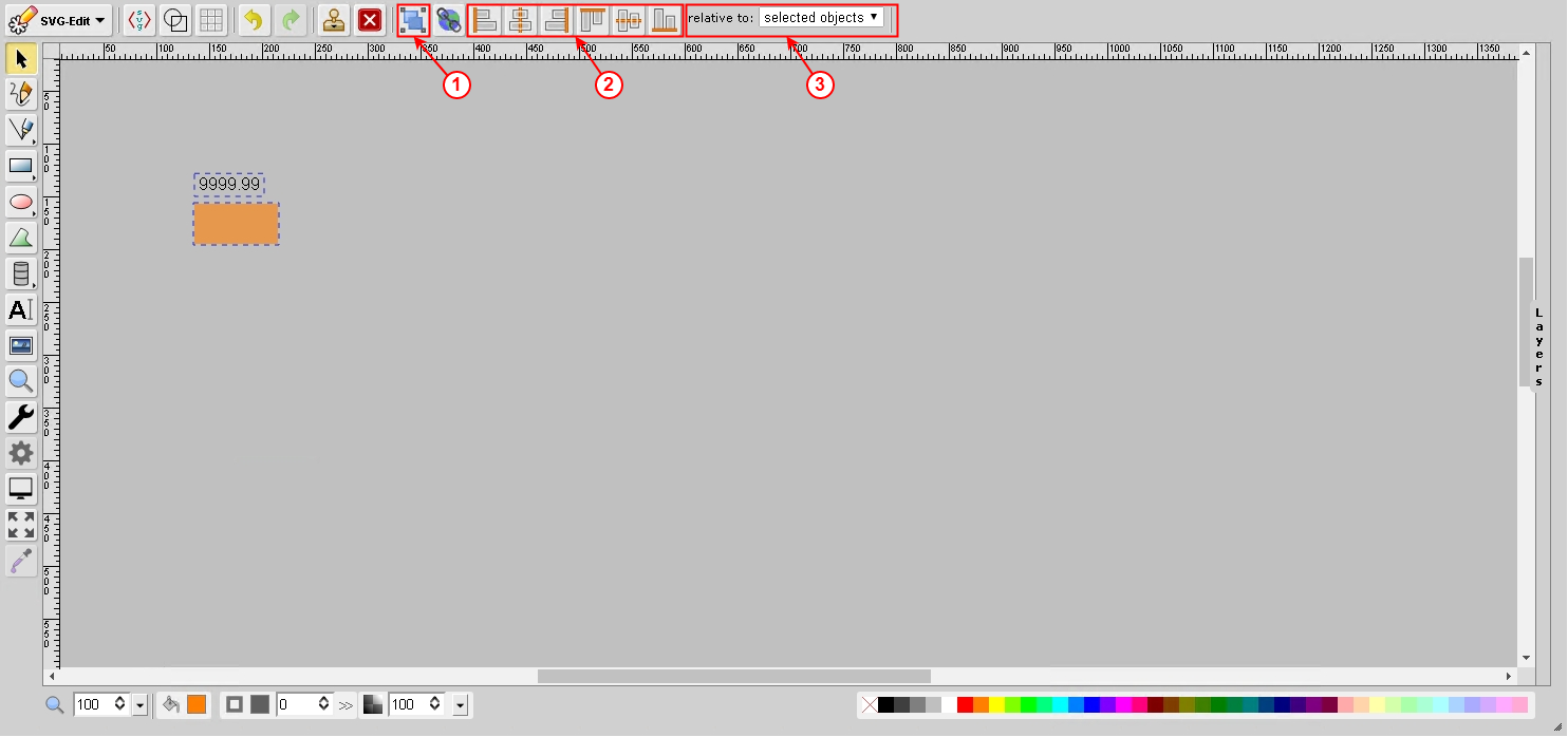
(1) - Group Elements - Group all selected elements.
(2) - Align Menu - This set of tools provide the user with the ability to align the selected elements.
(3) - Relative to - Allows the user to configure the Align Menu (selected objects, largest object,
smallest object, page).
When a static element is selected that is not a path, the Convert to Path option becomes available. This option will transform the element into a path element.
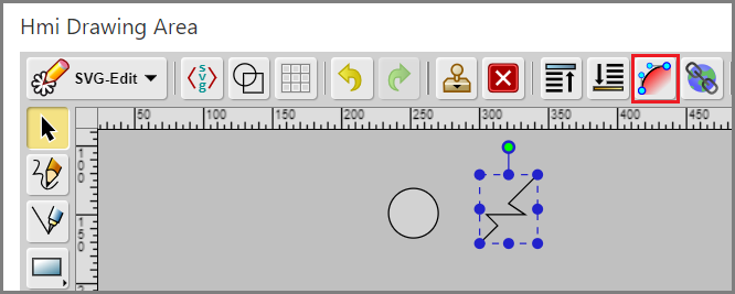
When a static element is selected that is a path, the Reorient Path option becomes available. This option will recalculate the points of the path and remove the rotation attribute from the element.
Shape Library
The SVG Editor contains dynamic base components (directives), which are used as the basic building blocks for rendering dynamic information. These base components can work independently, but can also be grouped into one element (Shape), which utilizes their separate functionalities. By consolidating the base components, different shapes can be built that vary in features and complexity. The Dynamic Shapes Development chapter explains the development process of such custom shapes.
Shape Configuration
This section covers all the details you need to know about configuring and customizing existing shapes in your dynamic pages. The Item Configuration tool in the editor provides the user with the ability to change the configuration of the shapes. This tool is accessed via the cogwheel icon on the toolbar, and becomes available after an element is selected.

The configuration options are spread into three separate tabs in the configuration panel:
PropertiesDirectivesComponents
Properties
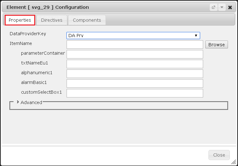
The Properties tab contains the data sources for the parameters of the shape. In SmartWEB these sources are known as points. A point is a data structure comprised of parameters of specific data types. Every shape uses an Opc Xml Da Data Provider to request and receive data. Available providers can be selected from the DataProviderKey field. For more information - see chapters Access to OPC data and Content Anatomy.
Note:
The fields following the DataProviderKey field are hidden until a provider is selected.
The ItemName field and corresponding subfields allow the user to enter one or more data sources (points) that are related to the behaviour of the shape. The expected input for each field is an Opc Xml Item Name, according to the
Opc Xml Da Specification 1.0. This is how specific points from the namespace of the server is accessed. Each of the subfields provides a data source for a specific base component. The label on the left side of each subfield is the Item Substitution (name) of the component referencing that data source. Visit the Dynamic Shapes Development chapter for more information on
Base Components and Item Substitutions.
Note:
If a subfield is left blank, the corresponding base component will use the point of the ItemName field.
The Browse button, to the right of the ItemName field, opens an Opc Xml Da Browser window, allowing an Opc Xml Item Name to be selected from the address space that corresponds to the chosen data provider. The Add button will add the selected item name to the ItemName field.
Directives
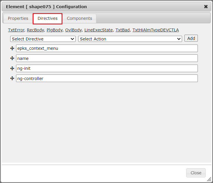
The Directives tab allows the user to assign specific directives to the shape. The directives are added to the elements as HTML attributes, and used to extend the functionality of standard HTML. The AngularJS framework processes these attributes.
Directives can be assigned to the shape via the Select Directive menu. The following options are available:

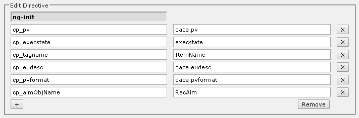
ng-init- Allows the scope of the shape controller to be extended with new fields (variables). All custom parameters of theshapeare declared and defined in this directive.Base Componentsand custom scripts will have access to these variables. This makes then an essential part of the configuration of theshape.
ng-class- This directive is used for styling. It is equivalent to theclass attributeinHTML. In addition, theng-classdirective can also contain a condition that will determine which class should be added.

i-ng-class- In SmartWEB, this directive provides a style with theming functionality to an element. It takes a function (ApplyNgTheme()) with one parameter - the name of the class that will be applied.
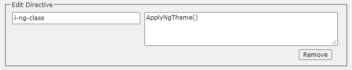
ng-click- This directive is equivalent to theonclickevent inHTML, and triggers when the user clicks on the element. In the example below, the directive is configured to call theRedirectToPagefunction when theshapeis clicked.
events.RedirectToPage("/unit1/hmi/100p01");

ng-controller- The value of this directive is the name of the controller which will initialize theshape.

ng-style- This directive allows the addition of standardCSSstyles. The styles must be in the following syntax:
{cursor: "pointer"}
{css_property: "css_property_value"}

name- This directive adds a standardHTMLattribute to the element. It is commonly used for shape naming, but it can also add otherHTMLattributes.

sw-onready-function- This directive allows the user to execute a function once after the page has been loaded.

The following function declaration must be provided in the JavaScript source file -
smartsys-opcxmlda-custom-all-4xx.min.js (or another file that is loaded inside the page).
This file is located in the following directory - \Modules\Smartsys.OpcXmlDa\Scripts.
window.my_function = function (me) {
...
}
The Dynamic Shapes Development chapter explains JavaScript custom functions.
epks_base_element- This directive provides a unique name for thesvgelement within theshapescope and is usually used inshapedevelopment.

References to the configuration of each base element are located at the top of the Directives tab.
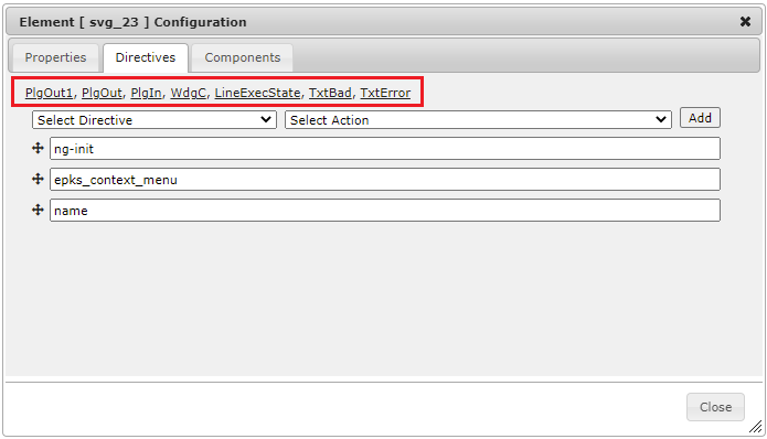
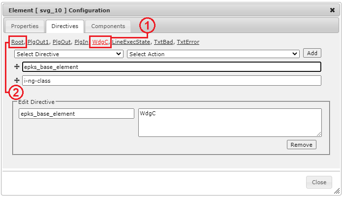
The user can access the configuration of a base element by selecting the label with the name of that element. The label for that element will be highlighted in red ((1) in the image below). To return to the main configuration window of the shape, the Root option can be selected ((2) in the image below). This option is visible only when a base element has been selected.
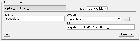
еpks_context_menu- This directive creates the context menu of theshape. The editor has a set of actions that can be added to the context menu with the+button, located in the lower-left corner of the directive.

The following image presents the context menu on the web page.
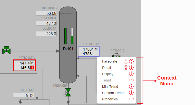
The available context menu actions are the following:
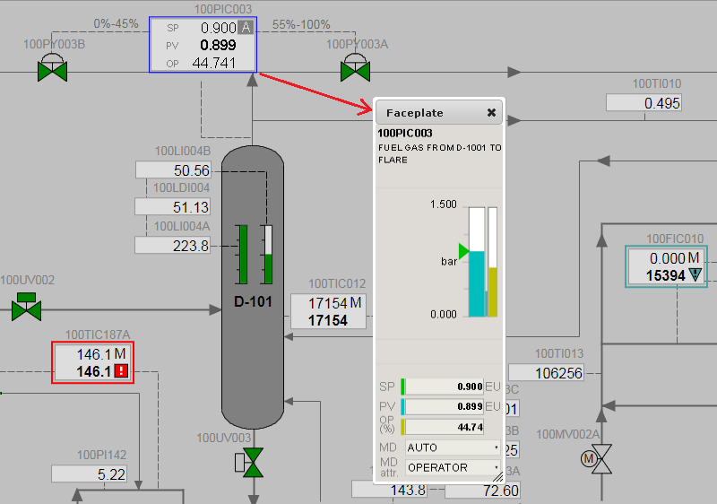
(1) - Faceplate - This action will open a popup window with essential information about the system point (entity) behind the selected shape (Process measurement, PID Controller, Motor Control, etc.). The Name field allows the user to provide the context menu label for this option. In this example it is configured as Faceplate. The faceplate is an independent page in the CMS and has its own address. The address of the faceplate is entered in the Url field, as it is shown in the following image.
The following image presents an example faceplate for the Honeywell EPKS - PID controller.
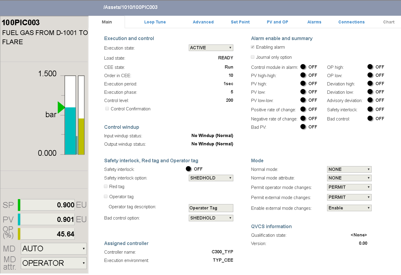
(2) - Detail - This action will redirect the user to the detail display page of the point. The page presents detailed point information. The configuration of the detailDisplay action is the same to that of a faceplate, but unlike the faceplate, the detail display opens in a new page.

The following image presents an example detail display for the Honeywell EPKS - PID controller.
(3) - Faceplate from ObjectStore - This action has the same behaviour as the faceplate option, with the exception that the address to the faceplate page is not entered. It is stored in Object Store, and taken automatically by the system. If the point does not exist in the Object Store, the menu link will be inactive.

(4) - Detail display from ObjectStore - The behaviour of this action is similar to the Detail display option, with the exception that the address of the detail display page is taken automatically from the Object Store. If the point does not exist in the Object Store, the menu link will be inactive.

Note:
SmartWEB provides pre-built Faceplates and Detail displays for all point types used in Honeywell EPKS. For other DCS, such system pages need to be additionally developed.
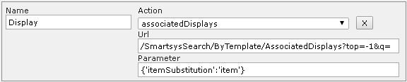
(5) - Associated Displays - This action will open a dialog box with a list of links to content items in which the selected point is present. There are two configurable fields for this action - Url and Parameter. The expected input of the Url field is a pre-created Smart Search Template. This template handles the indexing of content items, taking into account user permissions. The expected input for the Parameter field is an Item Substitution, which is configured in the Properties tab. The Site Settings chapter provides a detailed explanation of Smart Search Templates.
Example of the Associated Displays action on the web page:

(6) - Associated Trends - The configuration and usage of this action is the same as the
Associated Displays action, with the difference that the system returns a list of associated trends instead of associated content items.
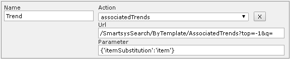
(7) - Mini Trend - This action invokes a popup window that visualizes a trend. The expected input for the Url field is the address of the trend content item. The Parameters field allows the user to determine which parameters will be displayed on the trend. The Dygraph Trend chapter describes the configuration and features of the trend.
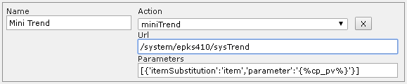
The expected input for the mini trend parameters is in JSON format. The user must provide an
item substitution and a parameter name for each of the trend traces. The Parameters field supports custom parameters defined in the ng-init directive of the shape (Example: cp_pv = pid_pla.pv). Both of the following examples are viable.
Custom parameters example:
[
    {'itemSubstitution':'item','parameter':'{%cp_pv%}'},
    {'itemSubstitution':'item','parameter':'{%cp_sp%}'},
    {'itemSubstitution':'item','parameter':'{%cp_op%}'}
]
Original parameter names example:
[
    {'itemSubstitution':'item','parameter':'pid_pla.pv'},
    {'itemSubstitution':'item','parameter':'pid_pla.sp'},
    {'itemSubstitution':'item','parameter':'pid_pla.op'}
]
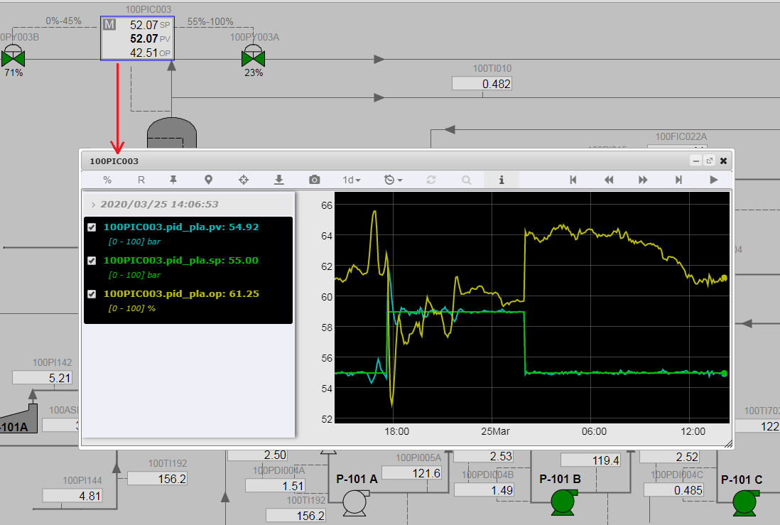
Example of a mini trend on the web page:
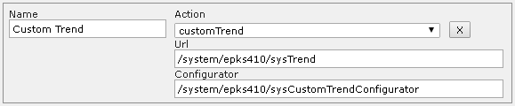
(8) - Custom Trend - This action invokes a popup window that allows the user to select specific parameters from multiple shapes on multiple pages. The left column of the panel (Available Parameters) lists the parameters of the current shape(from which the panel was invoked). The right column of the panel (Trend Parameters) lists the parameters that will be displayed on the trend. The parameters in this list will be saved and available to the user across multiple pages every time he invokes the custom trend panel. Parameters can be moved between the two columns by clicking on the parameter names. Optionally, the user can provide a title for the custom trend in the input field at the top of the panel. The trend window can be invoked via the Trend button in the bottom right corner of the panel.
Note:
The parameters listed in the Available Parameters column are the mini trend parameters configured for the shape.
There are two configuration fields for the custom trend action (Url, Configurator). The expected input for the Url field is the address of the trend content item. Usually, the same trend content item is used for both mini trends and custom trends. The expected input for the Configurator field is the address of the custom trend configurator content item.
Example of a custom trend configuration panel on the web page:

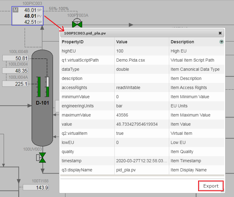
(9) - Properties - This action executes the OPC XML DA - GetProperties method for the ItemName and returns the result in a popup window. The result can be exported in Excel format via the Export button in the bottom right corner of the panel.
There is one configuration field (Parameter) for the properties action. The expected input is in JSON format. The expected key value pairs follow the same principals as the mini trend configuration.

Example of a properties panel on the web page:
The context menu can be triggered by a left or right mouse click. This option is configurable from the Trigger setting, as shown in the image below:

Base Components
Every Shape is a group of standard svg elements (line, polyline, rectangle, circle, etc.)
and base components. Currently, in SmartWEB, there are two separate libraries. One for
older base components and one for newer versions that support theming (EPKS release 500 and up) and may provide additional functionality.
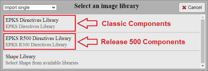
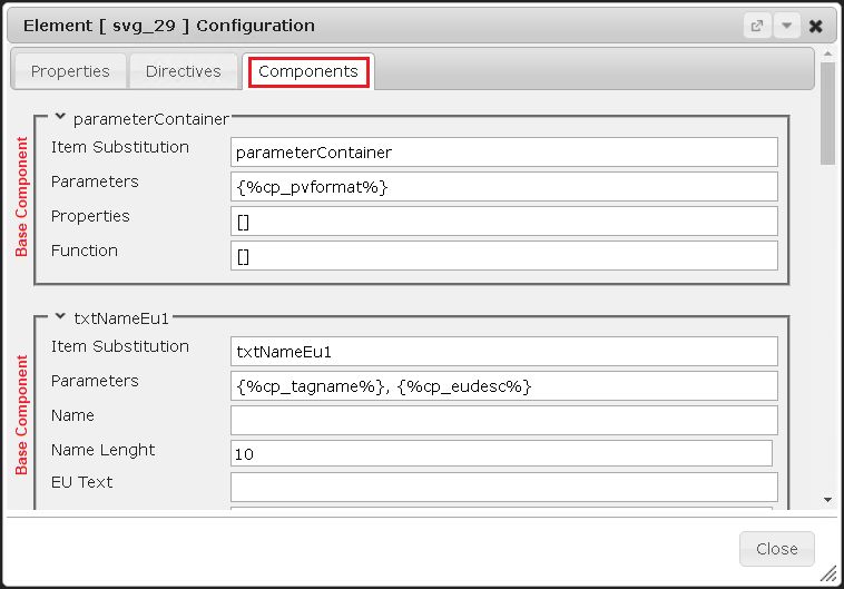
Each Base Component is configurable. The configuration of the individual components is done through the Components tab in the configuration panel.
The Base Components in the editor are divided into four categories (Alarm Components, Analog Components, Digital Components, Auxiliary Components). Their respective configurations are explained below. This section will go through the configuration of each component.
(1) - Alarm Components - The components from this category are designed to animate alarm states.
- Alarm Basic
This Base Component represents a standard Honeywell EPKS alarm icon with three different priorities (Urgent, High, and Low), and two unacknowledged states for each property (Active and Inactive).
Shape library view:

Component configuration view:

| Name | Descriptor |
|---|---|
| Item Substitution | Component name (unique inside the shape scope). |
| Parameters | Data parameters used to determine behaviour. |
| Style | CSS properties used for styling. |
| Class | CSS classes used for styling. |
Style and class configuration has the following syntax:
[{ style: "cursor", value: "pointer" }]
[("class1", "class2")]
Front-end examples of the Alarm Basic component:

- Alarm Basic R500
Visually identical to the classic Alarm Basic component. In regards to functionality, the R500 version supports theming and critical alarm priority (Critical, Urgent, High, and Low). The Class and Style fields have been removed, and a new option for scaling has been added, which will keep the original size of the component or allow it to be stretched, depending on the setting.
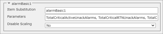
| Name | Descriptor |
|---|---|
| Item Substitution | Component name (unique inside the shape scope). |
| Parameters | Alarm parameters used to determine behaviour. |
| Disable Scaling | Determines whether the alarm will be scaled. |
The final difference between the two variants is that with the updated R500 version, the order of the parameters does not matter, which makes the component easier to use.
- Passive Alarm R500
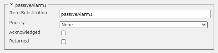
This is a unique R500 component and does not have an older predecessor. It is visually identical to the classic Alarm Basic component. The main difference comes from the functionality it provides. The Alarm Basic has specific behaviour which is dependent on data parameters. The Passive Alarm is designed to work in conjunction with a custom function, where the alarm state will be set manually by the script, based on specific logic.
| Name | Descriptor |
|---|---|
| Item Substitution | Component name (unique inside the shape scope). |
| Priority | The alarm priority that will be displayed. |
| Acknowledged | Determines whether the alarm will indicate the acknowledged state. |
| Returned | Determines whether the alarm will indicate the returned state. |
- Text Alarm
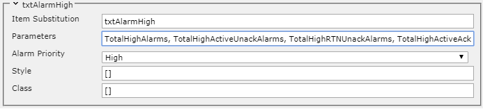
This Base Component symbolizes a single priority alarm with two unacknowledged states for an Active and Inactive alert. The component also shows the number of active alarms from the configured priority.
Shape library view:

Component configuration view:
| Name | Descriptor |
|---|---|
| Item Substitution | Component name (unique inside the shape scope). |
| Parameters | Alarm parameters used to determine behaviour. |
| Alarm Priority | The alarm priority that will be displayed. |
| Style | CSS properties used for styling. |
| Class | CSS classes used for styling. |
Style and class configuration has the following syntax:
[{ style: "cursor", value: "pointer" }]
[("class1", "class2")]
Front-end examples of the Text Alarm component:

(2) - Analog Components - The components from this category animate analog measurements.
- Alphanumeric
This Base Component presents alphabetical and numerical characters. It is widely used in most shapes that present analog data.
Shape library view:

Component configuration view:
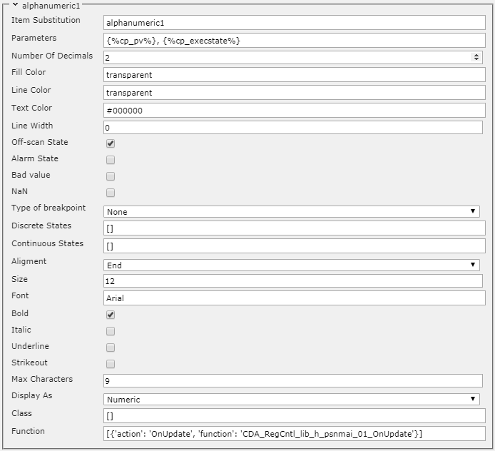
| Name | Descriptor |
|---|---|
| Item Substitution | Component name (unique inside the shape scope). |
| Parameters | Data parameters used to determine behaviour. The default values are ['PV', 'OnScan']. It is good practice to assign the parameters to a variable via the ng-init directive ({%cp_pv%}, {%cp_execstate%}). The second parameter is used in conjunction with the Off-scan State option. This functionality animates the bahaviour of the EXECSTATE and ONSCAN parameters (from Honeywell EPKS). |
| Number Of Decimals | The number of digits after the decimal point. Applicable for numeric values. |
| Fill Color | Background color. The default value is transparent. |
| Line Color | Border color. The value must be a valid HEX color (example: #ff0000). The default value is transparent. |
| Text Color | Text color, the value must be a valid HEX color (example: #ff0000). |
| Line Width | Border width. |
| Off-scan State | This option instructs the component to animate the Active/Inactive state, according to the value of the second data parameter. |
| Alarm State | Not used. |
| Bad value | Not used. |
| NaN | Not |
| used. | |
| Type of breakpoint | There are three available choices (Continuous, Discrete, None). With this option, it is possible to add an additional animation, depending on the value of the variable. The following two configuration options ( Discrete States, Continuous States), depending on the type of variable, determine the type of the animation. |
| Discrete States | If a Discrete value is selected for the Type of breakpoint option, then the animation for several discrete states will be configured here e.g. [{ state: 0, color: '#ff0000', inverse: true }, { state: 1, color: '#0000ff', inverse: true }]. Other discrete states can be described similarly. |
| Continuous States | If Continuous is selected for the Type of breakpoint option, then the animation characterization will be configured here e.g. [{ rangeFrom: 0, rangeTo: 50, color: '#ff0000' }, { rangeFrom: 50, rangeTo: 100, color: '#0000ff' }]. The range can be divided into more intervals, providing different animations. |
| Alignment | This option provides three choices for text alignment (Start, Middle, End). |
| Size | Text size. |
| Font | Font family e.g. Arial, Times New Roman, etc. |
| Bold | Apply a bold style to the text. |
| Italic | Apply an italic style to the text. |
| Underline | Apply an underline style to the text. |
| Strikeout | Apply a strikethrough style to the text. |
| Max Characters | The maximum number of displayed characters, regardless of the length of the variable. |
| Display As | Instructs the Base Component to display the value in a specific way: (Numeric, Enumeration, Text). |
| Class | CSS classes used for styling (through the theme). |
| Function | Allows a custom function to be called when the data has updated. |
Function and class configurations have the following syntax:
[{ action: "OnUpdate", function: "Function_Name" }]
["class1", "class2"]
Note
The built-in custom functions can be located in the following source file - smartsys-opcxmlda-all-4xx.min.js. Additional custom functions with specific/custom behaviour can be created in the second available file - smartsys-opcxmlda-custom-all-4xx.min.js. Both files are located in the following directory - \Modules\Smartsys.OpcXmlDa\Scripts.
Front-end examples of the Alphanumeric component:

- Alphanumeric R500
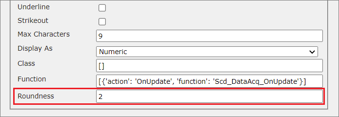
The new version of the Alphanumeric component supports theming and contains an additional field that provides the user with the ability to change the radius of the component.
- Indicator Bar
This Base Component provides a graphical representation of a variable in a given range. There are a number of ways to present data graphically (horizontal, vertical, line pointer, triangular pointer).
Shape library view:

Component configuration view:
| Name | Descriptor |
|---|---|
| Item Substitution | Component name (unique inside the shape scope). |
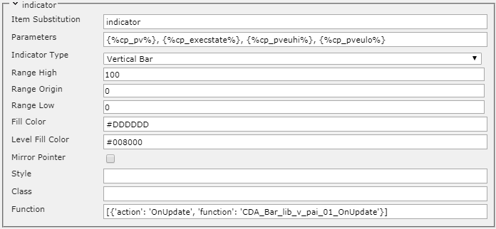
| Parameters | Data parameters used to determine the behaviour. The default values are ['PV', 'OnScan', 'EUHI', 'EULO']. It is good practice to assign the parameters to a variable via the ng-init directive ({%cp_pv%}, {%cp_execstate%}, {%cp_pveuhi%}, {%cp_pveulo%}). The value of the first parameter will be animated on the bar. The second parameter is not mandatory and can be omitted (the space between the parentheses is left blank). This parameter is commonly used to animate the behaviour of the EXECSTATE and ONSCAN parameters (from Honeywell EPKS). The values of the last two parameters represent the upper and lower values (the range) of the bar. |
| Indicator Type | Determine the appearance of the bar. The following options are available:Vertical Bar, Vertical Pointer, Vertical Line, Horizontal Bar, Horizontal Pointer, Horizontal Line. This option should be set during shape development (before the components are grouped), and should not be changed in the shape's component configuration tab. |
| Range High | A default value of type double that acts as the highest value that can be reached on the bar, when the third parameter ( {%cp_pveuhi%}) is not provided. |
| Range Origin | A default value of type double that is considered the point from which the bar will start to fill up. The bar will fill up starting from this origin position value to the value of the first data parameter ( {%cp_pv%}). This option is only taken into consideration when the IndicatorType option is set to Vertical Bar or Horizontal Bar. |
| Range Low | A default value of type double that acts as the lowest value that can be reached on the bar, when the fourth parameter ( {%cp_pveulo%}) is not provided. |
| Fill Color | Background color of the indicator. The value must be a valid HEX color. |
| Level Fill Color | Fill color of dynamic part (the animated part that will visualize the bar being filled). The value must be a valid HEX color. |
| Mirror Pointer | Applicable when the Vertical Pointer or Horizontal Pointer options are selected for the Indicator Type. The pointer will be displayed in a mirrored fashion. |
| Style | CSS properties used for styling. |
| Class | CSS classes used for styling. |
| Function | Allows a custom function to be called when the data has updated. |
Style, class, and function configuration has the following syntax:
[{ style: "cursor", value: "pointer" }]
[("class1", "class2")]
[{ action: "OnUpdate", function: "Some_Function" }]
Front-end examples of the Indicator Bar component:

- Indicator Bar R500
Visually identical to the classic Indicator Bar component with the exception of provided theme support. In regard to functionality, the R500 version has a key difference from its classic counterpart. The Range High, Range Origin, and Range Low fields in the configuration panel of the component have a higher priority in the R500 version. Their values will be considered over the ranges provided in the Parameters field, whereas in the classic version, it is the other way around. Additionally, the R500 version has a Mirror Bar option. When enabled, the bar will be mirrored in the opposite direction.
Note:
It is a common practice to provide the range parameters as values for the Range High,
Range Origin, and Range Low fields when there are no custom ranges. That way, the functionality will be the same as the classic version.
(3) - Digital Components - The components from this category animate discrete variables.
- Txt Mode One Letter
This Base Component represents the first letter of the operation mode abbreviation of DCS control entities. It is used in some built-in Honeywell EPKS shapes, which have the following abbreviations: MAN, AUTO, CASC, COMP, S-MAN, S-AUTO, S-CASC, S-COMP. The component also monitors the normal mode of the control entity, and represents the mode letter and mode letter background with different colors if the normal mode is active.
Shape library view:

Component configuration view:
| Name | Descriptor |
|---|---|
| Item Substitution | Component name (unique inside the shape scope). |
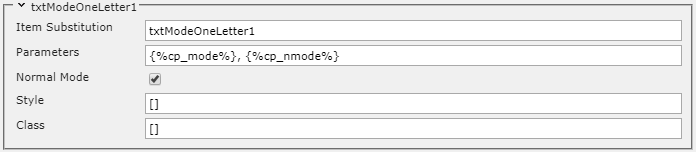
| Parameters | Data parameters. The default values are ['Mode', 'NORMALMODE']. It is good practice to assign the parameters to a variable via the ng-init directive ( {%cp_mode%}, {%cp_nmode%}). The first parameter monitors the MODE of the control entity. The second parameter monitors the NORMAL MODE. |
| Normal Mode | When the checkbox is checked, the component takes into account the normal mode parameter, and changes the colors of the letter and its background when the mode value differs from the normal mode value. |
| Style | CSS properties used for styling. |
| Class | CSS classes used for styling. |
Style and class configuration has the following syntax:
[{ style: "cursor", value: "pointer" }]
[("class1", "class2")]
Front-end examples of the Txt Mode One Letter component:

(4) - Auxiliary Components - These components perform a variety of support functions.
- Parameter Container
This Base Component does not have a graphical presentation on the front-end. It is used to collect dynamic data that can be used in custom functions to animate certain elements in the shape.
Shape library view:

Component configuration view:

| Name | Descriptor |
|---|---|
| Item Substitution | Component name (unique inside the shape scope). |
| Parameters | Data parameters. It is good practice to assign the parameters to a variable via the ng-init directive {%cp_pv%}, {%cp_execstate%}. The first parameter monitors the PV of the control entity. The second parameter monitors the EXECSTATE. |
| Properties | Parameters that will be gathered from the server via the OPC XML DA GetProperties method. |
| Function | Allows a custom function to be called when the data has updated. |
The function configuration has the following syntax:
[{'action': 'OnUpdate', 'function': 'Some_Function'}]
- Base Label
This Base Component provides the user with the ability to visualize text on the front-end. It is commonly used to attach a label to a shape.
Shape library view:

Component configuration view:
| Name | Descriptor |
|---|---|
| Item Substitution | Component name (unique inside the shape scope). |
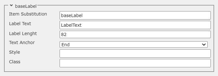
| Label Text | The text that will be displayed on the front-end. |
| Label Length | The length of the text. |
| Text Anchor | Determines the direction of the text. There are three available options ("Start", "Middle", "End"). |
| Style | CSS properties used for styling. |
| Class | CSS classes used for styling. |
Style and class configuration has the following syntax:
[{'style' : 'cursor', 'value' : 'pointer'}]
['class1', 'class2']
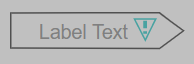
Front-end example of the Base Label component:
- Base Label R500
The new version of the Base Label component supports theming. In regards to functionality, the main difference between the R500 and classic versions is the way the text is positioned. In the R500 version, the Label Length field is replaced with two new fields (Text Width, Text Pos).
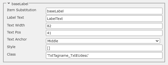
| Name | Descriptor |
|---|---|
| Item Substitution | Component name (unique inside the shape scope). |
| Label Text | The text that will be displayed on the front-end. |
| Text Width | Determines the width of the text in pixels. |
| Text Pos | Determines the position of the text in pixels. |
| Text Anchor | Determines the direction of the text. There are three available options ("Start", "Middle", "End"). |
| Style | CSS properties used for styling. |
| Class | CSS classes used for styling. |
- Button
This Base Component is used to perform a predefined action. When the button is clicked, the function in the Click field is called. This allows the user to attach additional functionality to the display.
Shape library view:

Component configuration view:
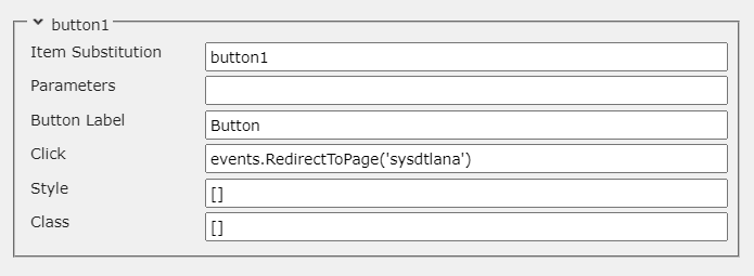
| Name | Descriptor |
|---|---|
| Item Substitution | Component name (unique inside the shape scope). |
| Parameters | Data parameters. It is good practice to assign the parameters to a variable via the ng-init directive. directive. |
| Button Label | The label of the button. |
| Click | The function that will be called when the button is pressed. A predefined list of functions, suitable for this button, is available, as well as a custom function option. |
| Style | CSS properties used for styling. |
| Class | CSS classes used for styling. |
Function, style, and class configuration has the following syntax:
events.RedirectToPage('Some_Page')
[{'style' : 'cursor', 'value' : 'pointer'}]
['class1', 'class2']
Front-end example of the Button component:
- Button R500
The Button R500 component is SVG based, unlike the classic version, which is HTML based. This means that the new version supports scaling, and the styling is done in a manner compliant with the SVG standard. The R500 version also supports 3D effects when clicked.
Component configuration view:
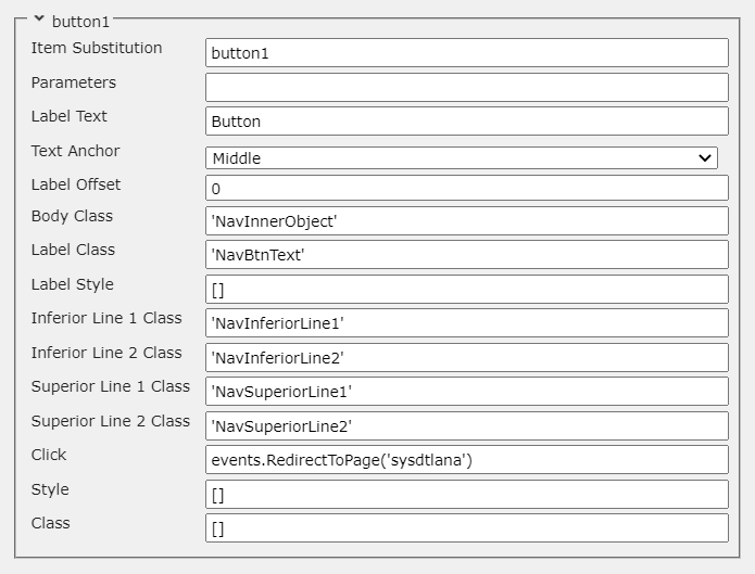
| Name | Descriptor |
|---|---|
| Item Substitution | Component name (unique inside the shape scope). |
| Parameters | Data parameters. It is good practice to assign the parameters to a variable via the ng-init directive. directive. |
| Label Text | Sets the text that will be displayed on the button. |
| Text Anchor | Sets the direction of the text. |
| Label Offset | Sets the offset of the text. |
| Body Class | Sets the class for the background of the button. |
| Label Class | Sets the class for the text of the button. |
| Label Style | Sets the style for the text of the button. |
| Inferior Line 1 Class | Sets the class for the Inferior Line 1 element (intended to provide a 3D effect). |
| Inferior Line 2 Class | Sets the class for the Inferior Line 2 element (intended to provide a 3D effect). |
| Superior Line 1 Class | Sets the class for the Superior Line 1 element (intended to provide a 3D effect). |
| Superior Line 2 Class | Sets the class for the Superior Line 2 element (intended to provide a 3D effect). |
| Click | The function that will be called when the button is pressed. |
| Style | CSS properties used for styling. |
| Class | CSS classes used for styling. |
Front-end example of the Button R500 component:
- Custom Selection Box
This Base Component is used to highlight the shape on the page when it is selected.
Shape library view:

Component configuration view:
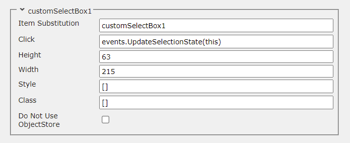
| Name | Descriptor |
|---|---|
| Item Substitution | Component name (unique inside the shape scope). |
| Click | The function that will be called when they shape is clicked on. |
| Height | The height of the Selection Box. |
| Width | The width of the Selection Box. |
| Style | CSS properties used for styling. |
| Class | CSS classes used for styling. |
| Do Not Use ObjectStore | If the checkbox is set to true (checked), the shape will try to gather data from the source provided in the ItemName field instead of the data in the ObjectStore. This is usually done when the server of the data source is different than the server of the provider, in which case visualizing trends will not be possible. This option provides a convenient solution to this problem. |
Function, style, and class configuration has the following syntax:
events.UpdateSelectionState(this)
[{'style' : 'cursor', 'value' : 'pointer'}]
['class1', 'class2']
Front-end examples of the Custom Selection Box component:

- Custom Selection Box R500
The new version of the Custom Selection Box component supports theming and contains an additional field that provides the user with the ability to change the radius of the component.
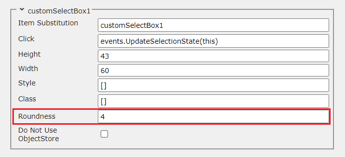
- TxtName
This Base Component is used to show the name of the point that is used to animate the shape. The component can also show a different name that is provided by the user.
Shape library view:

Component configuration view:
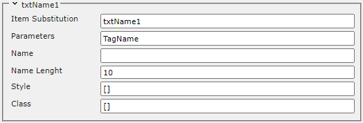
| Name | Descriptor |
|---|---|
| Item Substitution | Component name (unique inside the shape scope). |
| Parameters | Data parameters. It is good practice to assign the parameters to a variable via the ng-init directive ({%cp_tagname%} in this case). |
| Name | The name/text that is entered in this field will be displayed. If this field is left blank, the value of the data parameter ( TagName in this case) will be displayed instead. The user can hide the text by manually writing - in this field. |
| Name Length | The maximum number of characters that will be displayed. |
| Style | CSS properties used for styling. |
| Class | CSS classes used for styling. |
Style and class configuration has the following syntax:
[{'style' : 'cursor', 'value' : 'pointer'}]
['class1', 'class2']
Front-end examples of the TxtName component:

- TxtName R500
Identical to the classic TxtName component with the exception of provided theme support.
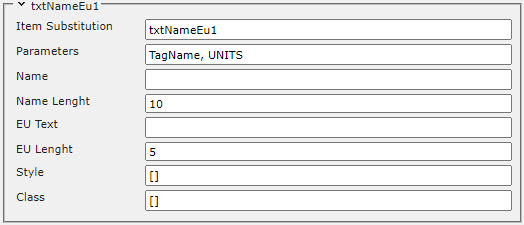
- TxtNameEu
This Base Component provides the same functionality as the TxtName component, but it also has the ability to display the engineering units of the point. There is usually a button on the display that allows to user to switch between the names and engineering units of the shapes or hide them.
Shape library view:

Component configuration view:
| Name | Descriptor |
|---|---|
| Item Substitution | Component name (unique inside the shape scope). |
| Parameters | Data parameters. It is good practice to assign the parameters to a variable via the ng-init directive ({%cp_tagname%}, {%cp_eudesc%} in this case). |
| Name | The name/text that is entered in this field will be displayed. If this field is left blank, the value of the data parameter that represents the name of the point ( TagName) is going to be displayed. The user can hide the name of the point by manually writing - in this field. |
| Name Length | The maximum number of characters that will be displayed for the name of the point. |
| EU Text | The engineering units that are entered in this field will be displayed. If this field is left blank, the value of the data parameter that represents the engineering units of the point ( UNITS) is going to be displayed. The user can hide the engineering units of the point by manually writing - in this field. |
| EU Length | The maximum number of characters that will be displayed for the engineering units of the point. |
| Style | CSS properties used for styling. |
| Class | CSS classes used for styling. |
Style and class configuration has the following syntax:
[{'style' : 'cursor', 'value' : 'pointer'}]
['class1', 'class2']
Front-end examples of the TxtNameEU component:

- TxtNameEu R500
Visually identical to the classic TxtNameEu component with the exception of provided theme support.
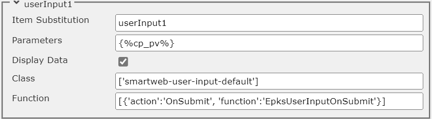
- UserInput R500
This component allows the user to attach an input field on the page with various functionalities.
Shape library view:

Component configuration view:
| Name | Descriptor |
|---|---|
| Item Substitution | Component name (unique inside the shape scope). |
| Parameters | The user has the option to set data parameters which will be used in the functionality of the input. |
| Display Data | When this option is enabled, the input will update its value every time the value of the parameter is updated on the server. |
| Class | CSS classes used for styling. |
| Function | Allows the user to attach a custom function that will determine the functionality of the input when a value is submitted ( Enter key is pressed) and/or the data has been updated on the server. There are two supported events - OnSubmit and OnUpdate. Functions for both events can be attached to the same input. |
Class configuration syntax example:
['class1', 'class2']
Function configuration syntax example:
//OnSubmit event
[{'action': 'OnSubmit', 'function': 'submitFunction'}]

//OnUpdate event
[{'action': 'OnUpdate', 'function': 'updateFunction'}]

//both events
[
    {'action': 'OnSubmit', 'function': 'submitFunction'},
    {'action': 'OnUpdate', 'function': 'updateFunction'}
]
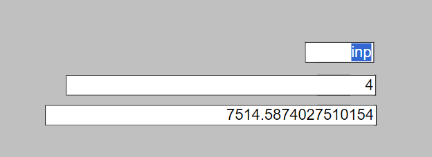
Front-end example of the UserInput component:
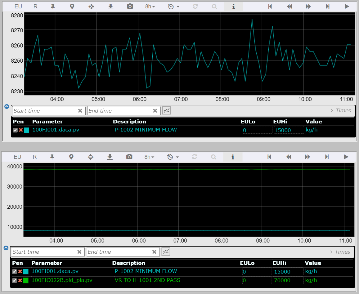
- EmbeddedTrend R500
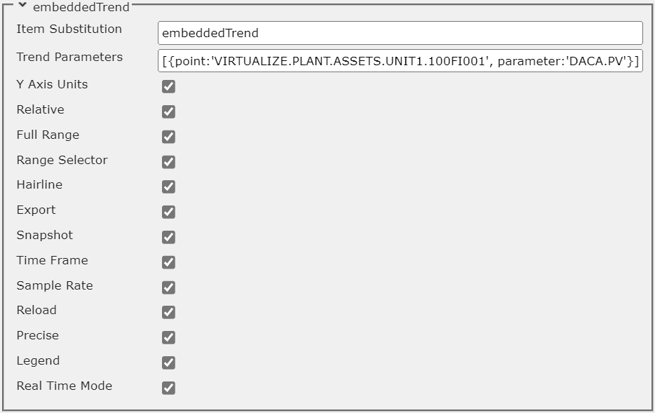
This component allows the user to embed a trend in the display. The trend will run when the page loads and will remain in static position.
Shape library view:

Component configuration view:
| Name | Descriptor |
|---|---|
| Item Substitution | Component name (unique inside the shape scope). |
| Trend Parameters | The parameters that will be visualized on the trend. |
| Y Axis Units | Enables the trend toolbar Y Axis Units option button. |
| Relative | Enables the trend toolbar Relative option button. |
| Full Range | Enables the trend toolbar Full Range option button. |
| Range Selector | Enables the trend toolbar Range Selector option button. |
| Hairline | Enables the trend toolbar Hairline option button. |
| Export | Enables the trend toolbar Export option button. |
| Snapshot | Enables the trend toolbar Snapshot option button. |
| Time Frame | Enables the trend toolbar Time Frame option button. |
| Sample Rate | Enables the trend toolbar Sample Rate option button. |
| Reload | Enables the trend toolbar Reload option button. |
| Precise | Enables the trend toolbar Precise option button. |
| Legend | Enables the trend toolbar Legend option button. |
| Real Time Mode | Enables the trend toolbar Real Time Mode option button. |
Trend parameters configuration syntax example:
//single parameter

//point in object store
[{point:'100FI001', parameter:'DACA.PV'}]

//point not in object store
[{point:'VIRTUALIZE.PLANT.ASSETS.UNIT1.100FI001', parameter:'DACA.PV'}]


//multiple parameters

//points in object store
[
    {point:'100FI001', parameter:'DACA.PV'},
    {point:'100FIC022B', parameter:'PID_PLA.PV'}
]

//points not in object store
[
    {point:'VIRTUALIZE.PLANT.ASSETS.UNIT1.100FI001', parameter:'DACA.PV'},
    {point:'VIRTUALIZE.PLANT.ASSETS.UNIT1.100FIC022B', parameter:'PID_PLA.PV'}
]
Front-end example of the Embedded Trend component:
Display Configuration
This tool is used to edit the global display configuration. Every zone that contains an Svg Editor has its own configuration that is responsible for the shapes in the respective area.
General
General tab view:
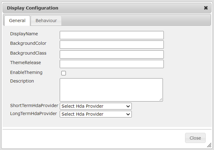
| Name | Descriptor |
|---|---|
| DisplayName | Sets an additional property to the display object. |
| BackgroundColor | Sets the background color of the canvas. |
| BackgroundClass | Sets the background class of the canvas. |
| ThemeRelease | Sets the theme release for the display. This field determines the version of the css classes that will be applied. |
| EnableTheming | This option enables and disables theming. When the checkbox is set to true (checked), the theming for the display is enabled. |
| Description | Sets a description for the display. |
| ShortTermHdaProvider | Sets one of the HDA Providers that were added to the corresponding Content Type as the short-term provider for the display. The chosen provider will be used to retrieve historical data from the short-term history server. |
| LongTermHdaProvider | Sets one of the HDA Providers that were added to the corresponding Content Type as the long-term provider for the display. The chosen provider will be used to retrieve historical data from the long-term history server. |
Behaviour
General tab view:
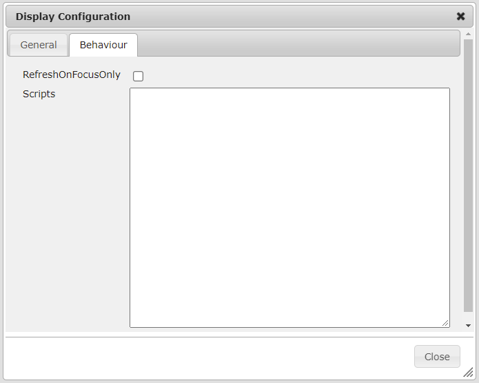
RefreshOnFocusOnly - If the browser supports the Page Visibility API and this functionality is enabled, SmartWEB will track whether the browser tab is in focus. When the user switches to another tab, the page will stop sending data requests, resulting in faster response times and reducing the number of requests sent to the server. The data requests will resume when the user returns to the tab.
Scripts - This field can hold standard JavaScript code. After the page is loaded, this code will be added to the page scope, and will be accessible to all page components. Usually, this field is used for JavaScript functions, which can be called from the page components and dynamic shapes.
Display Diagnostic
The Diagnostic tool is used for analysis and diagnostics of standard errors that may occur when working with the editor. For each error or warning that is found, there is a corresponding row in the panel, which provides the results of the analysis. One or more rows can be present for each shape, as there can be more than one error in different parts of the shape, as well as more than one parameters.
For each error found, a ShapeId button is added (unique identifier for the shape in the
editor). When clicked, it will directly select the shape. This is done so that the user does not have to look for the exact location of the shape on the
page. The Error column contains the error code. It may be different for each type of error that is analyzed by the tool. The Status column provides a description for the error or warning. The description is as detailed as possible. It can help the user decide how to handle the error. For some errors, there is a repair mechanism, which is available via the Repair button, located in the last column. The Repair All button will clear all errors.
Diagnostic Panel views:
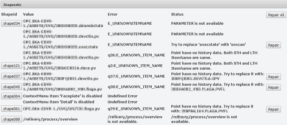
The analysis of each display can be started via the Diagnostic button, and presents the data in the following order: Opc Da related data,
Context Menu related data, MiniTrend related data, and Navigation related data.
Opc Da
The Opc Da section analyzes errors that would occur when the display is started on the client side(invalid parameters or points). These errors are analyzed according to the Opc Xml Da specification. Some errors can occur as a result of the absence of the parameter / the point from POS (Persistent Object
Store). Another reason may be that the server to which points are directed is unavailable etc. Some of these errors can be easily analyzed and handled via the Repair button, when this is not possible, information is displayed in the dialog box, allowing the user to decide on whether and how the errors should be handled.
After analyzing all the errors, they are synthesized into several types, and the user will be able to see some of the following messages:
| Name | Descriptor |
|---|---|
{PARAM} must be removed |
The parameter must be deleted (the parameter is not needed or not used). This can be done safely through the REPAIR button. |
{PARAM1} must be replaced with {PARAM2}. |
The analysis has detected an invalid parameter (PARAM1) that must be replaced with a valid parameter ( PARAM2). This can be done safely through the REPAIR button. |
Try to replace {PARAM1} with {PARAM2}. |
The analysis has detected a problem with this parameter. A possible reason is that the parameters for the execution state of CDA and SCADA points (respectively EXECSTATE and ONSCAN) have been switched. The REPAIR button will safely replace the invalid parameters with the valid ones. |
POINT is not available in POS (maybe TagName != ItemName) |
The point is not found in the POS. A possible reason may be that it is available under another key. |
| PARAMETER is not available | The point is available on the server from which the data is being read, but there is a problem with the parameter. A possible reason may be an invalid parameter. |
| POINT server is not reachable, but it's in POS |
The server from which the point is being read is not available. Possible reasons may be: the server has been stopped, the server address is incorrect, restrictions that are related to access rights, other server related issues. |
| POINT is not available | The point is not available on the server. A possible reason may be that the entered point name is incorrect. |
| Unspecified error | Unknown error. |
Context Menu
The Context Menu section analyzes context menu related errors. The context menu is programmatically tested for errors that would be returned during a normal operation on the client side (with the current configuration of the shape).
The analysis checks if the context menu can be opened, and if
all of its options are available. If an option is not
enabled this may indicate that it is not configured correctly, or there is a
problem with some of the components it works with.
The possible errors are described below:
| Name | Descriptor |
|---|---|
| Context Menu |
Unspecified error. |
| Broken context menu | The menu is broken and will not open, a possible reason may be that the configuration of one of the menu elements is broken or entered incorrectly. |
MiniTrend
The Mini Trend section analyzes errors related to a mini trend, which is an option in the context menu. The system checks if the parameters exist in their respective servers, as well as the availability of any historical data for the parameters. Each parameter is checked for available historical data in the STH (Short
Term History Server) and LTH (Long Term History Server). ItemName's that will be read are taken from the POS (Persistent Object Store).
The possible errors are described below:
| Name | Descriptor |
|---|---|
| Parameter is not available in STH/LTH server. |
The parameter is not found on the servers that read from the STH or LTH servers. |
| Parameter is not available in POS. |
The parameter is not available in the POS. This means that the ItemName of this parameter cannot be found, and the MiniTrend cannot be displayed. |
| Communication error | Unspecified communication error. |
| Point have no history data. Try to replace it with: {PARAM}. |
This parameter has no historical data, but a compatible parameter was found in the POS (Persistent Object Store). It can be replaced via the REPAIR button. |
| Point have no history data. Both STH and LTH ItemName are same. |
This parameter has no historical data, and the ItemNames for the STH and LTH are the same. A possible reason may be that the historical data of this parameter is not configured to be archived in the STH and LTH. The Opc Xml Da ItemName is used. |
Navigation
The Navigation section analyzes errors related to the navigations of the
display. The validity of all navigations is checked, as well as if the resource they lead to is available. The path to each new display can be written in 2 ways:
| Name | Descriptor |
|---|---|
| relative / absolute path (URL) | Example: /process/overview. In this case, the display will be redirected to the specified resource. |
POS key |
Example: OVERVIEW, where OVERVIEW is a key in the POS, and the path to the desired resource (in this case - display /process/overview) is adjacent to it. The display will take the url from the POS and then redirect to it. |
The possible errors are described below:
| Name | Descriptor |
|---|---|
Display POS |
The navigation to this display uses a POS key but it is not found. In this case, the navigation will not redirect to the desired display. |
The navigation to this display uses the display URL, but an error 404 Not Found is returned when access is attempted. In this case, the navigation will not redirect to the desired display. |
Data Presentation
This section will go over the structure of the data flow in SmartWEB, which allows data to be taken from the server and visualized in the browser. The following image is an example of a dynamic web page that was created with the use of the SVG Editor.
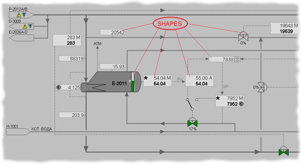
There are multiple components which are responsible for retrieving, handling and visualizing data in order to create the dynamics of the SVG content in the web page. The following block diagram represents the interaction between these components.
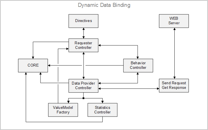
SmartWEB utilizes AngularJS as its front-end framework. This framework is a crucial component of the system, responsible for bootstrapping HTML, delivering application data, and binding HTML elements to the data model. Each of the controller blocks incorporates AngularJS functionality.
The CORE block contains references to all dynamic elements. These elements are registered in the following controllers: Requester Controller, DataProvider Controller,
Statistics Controller, Display Behaviour Controller. The CORE block is also responsible for data requests from the page to the web server. These requests can be enabled or disabled through the functionality of the block.
The Requester Controller block is responsible for registering all dynamic elements configured in the SVG Editor as requesters on the front-end. Each dynamic element is registered in the controller with a local Initialize function. The function uses the references from the CORE block for each element to register them as a requester. The requesters are then prepared for data requests. The Requester Controller block ensures that each requester on the page visualizes the data from the server accurately.
The Directives block contains AngularJS directives (alphanumeric, parameter container, etc.). It is responsible for the behaviour of each directive and the way it visualizes data. Working with directives is explained later in this chapter.
The Display Behaviour Controller contains functionality and information relevant to the page. This includes the display id and name, options and settings for the Opc Xml Data Providers, bootstrapping of Opc Xml Data Providers, page styling, references to relevant items (requesters, item paths etc.) and browser information.
The DataProvider Controller is responsible for the communication between the page and the server, adhering to the OPC XML Specification DA 1.0 standards.
Every SmartWEB page that visualizes data from a server is an Opc Xml client. The DataProvider Controller formats the request and submits it to the Sent Request / Get Response block. The only purpose of the block is to send the request to the server and wait for a response. The data from every response is sent back to the DataProvider Controller. This updates the Value Model in the ValueModel Factory block. An OnDataChange event is triggered after the model values update. The Requester Controller listens for this event and updates all directives in its scope.
The Statistics Controller takes care of communication statistics. Tracks response times, number of requests per every method, etc.
Summary
In this chapter, we have learned about the use of the HMI EDITOR and its essential components. It is a vital tool for display building, and provides a variety of built-in options and components that provide convenient functionality.